


Pandvil Network
ROLE
TIMELINE
TOOLS
ABOUT PANDVIL
Pandvil Network is one of the biggest Fortnite Creative platforms out there, games played by over a million people every day. Basically a game studio operating inside a game platform.
I joined on contract doing thumbnails. Kept shipping, kept taking on more, and six months in they put me on full-time to lead design entirely: game UI, thumbnails, 3D models, marketing videos, web.
0.0M
Followers
0.0B
Minutes Played
0M
Favorites
Built a system that increased followers 10× across 20+ live experiences
PROBLEM
Our games were getting millions of plays, but likes, favorites, and follows weren’t keeping up. That gap actually matters. Fortnite’s discovery algorithm leans hard on engagement signals, so low likes and favorites meant less algorithmic reach, less social proof, and slower growth, even when a game itself was doing great.
RESEARCH
I started by figuring out who we’re actually designing for, and looking at what other platforms were already doing. Two things stood out.

Fortnite’s player base is mostly kids
They’re not going to go looking for a follow button, or think to favorite on their own. If you don’t ask, they won’t do it.

The YouTube principle
Same reason every YouTuber says “like and subscribe.” It works because people need the reminder.
Most creators already knew this, they just did it badly.
OTHER CREATORS

Popups take up ¼ of the screen
Loud, impossible to ignore
Actively hurts gameplay experience
Map code shows name, not actual code
Breaks TOS
OUR APPROACH

Subtle, non-disruptive prompts
Appears every 10-15s, easy to dismiss
Respects the gameplay experience
Shows actual map code for discovery
Doesn’t break TOS
SOLUTION

The Popup
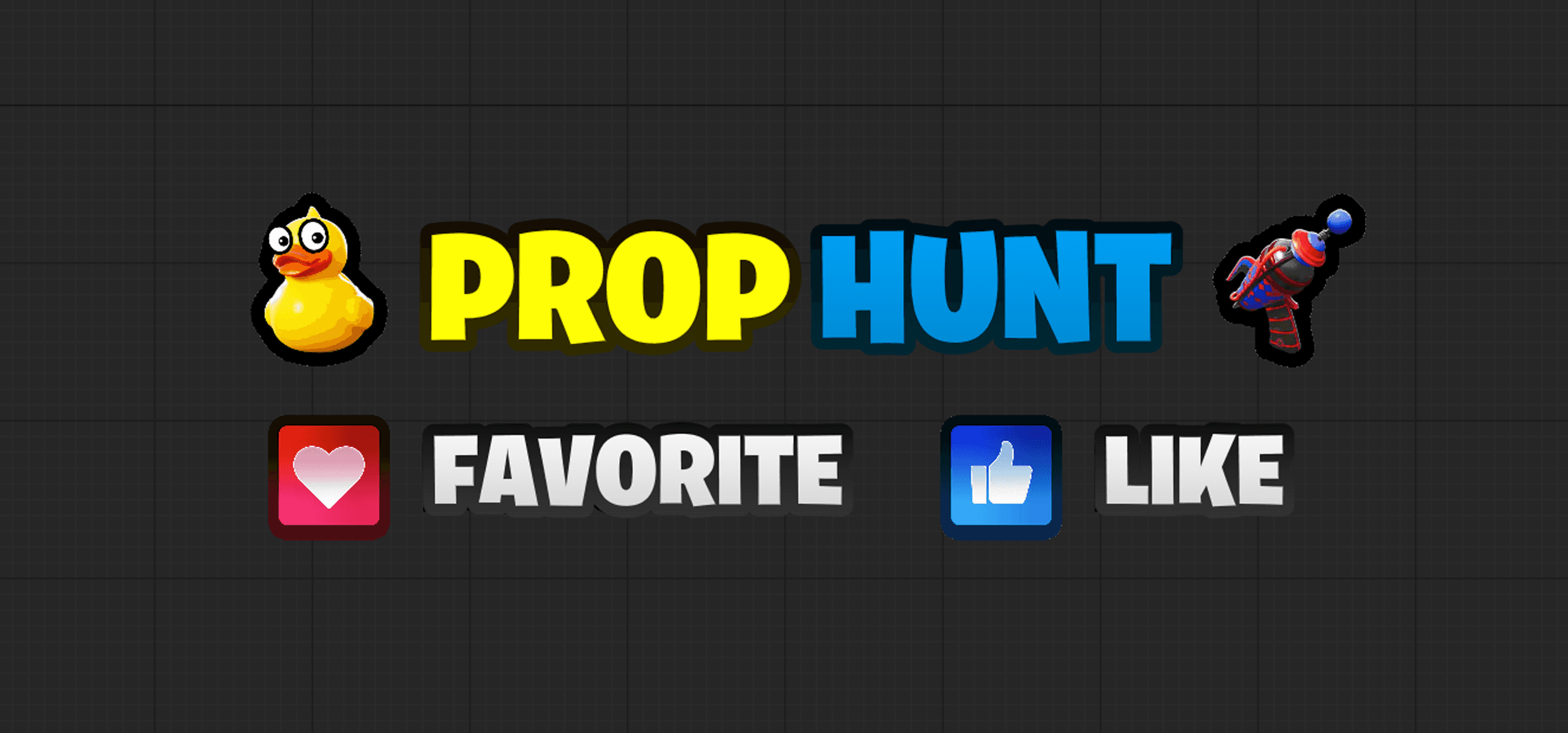
Shows the map code and nudges players to like and favorite, every 10 seconds. It also doubles as a discovery tool when clips go viral, since it’s showing the exact code people need to find the map again.

Physical Alert
Reinforces the same message in-game, but built to match the game’s actual visual quality instead of feeling bolted on.
ITERATIONS

Competitive Style
Clean, minimal, and zero distraction.

Variety
Cartoony, kid-friendly approachable style
IMPACT
0X
Follower Growth
0K
→
0.0M
Followers
Rolled out across 20+ live Pandvil experiences, each with its own tailored version. I kept iterating on prompt cadence and visual treatment until I found the balance between being seen and not being annoying.

1.6M notified per release
Higher launch day players

Compounding growth
The real value of 1.6M followers:
Every new release gets pushed to 1.6M players → higher launch traffic → Discovery page → millions of new players.
Engagement
Better visibility
More players

Repeat
REFLECTION
This project changed how I think about design impact. I didn’t expect a small UI element to move the needle more than any thumbnail, trailer, or full visual redesign I’d done. Turns out the highest-leverage work isn’t always the most visible.
PROBLEM
Our competitive maps got millions of plays too, but the UI wasn’t built for how fast competitive play actually moves.

01 — Selection UI
Too many steps. A “Your Selection” panel, a confirmation flow, an ambiguous Skip vs Close, friction stacked on a moment that should take two seconds.
02 — Rank UI
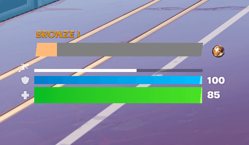
The rank didn’t feel like it belonged. Didn’t line up with Fortnite’s native health and shield system, visually or spatially.
03 — Transition UI
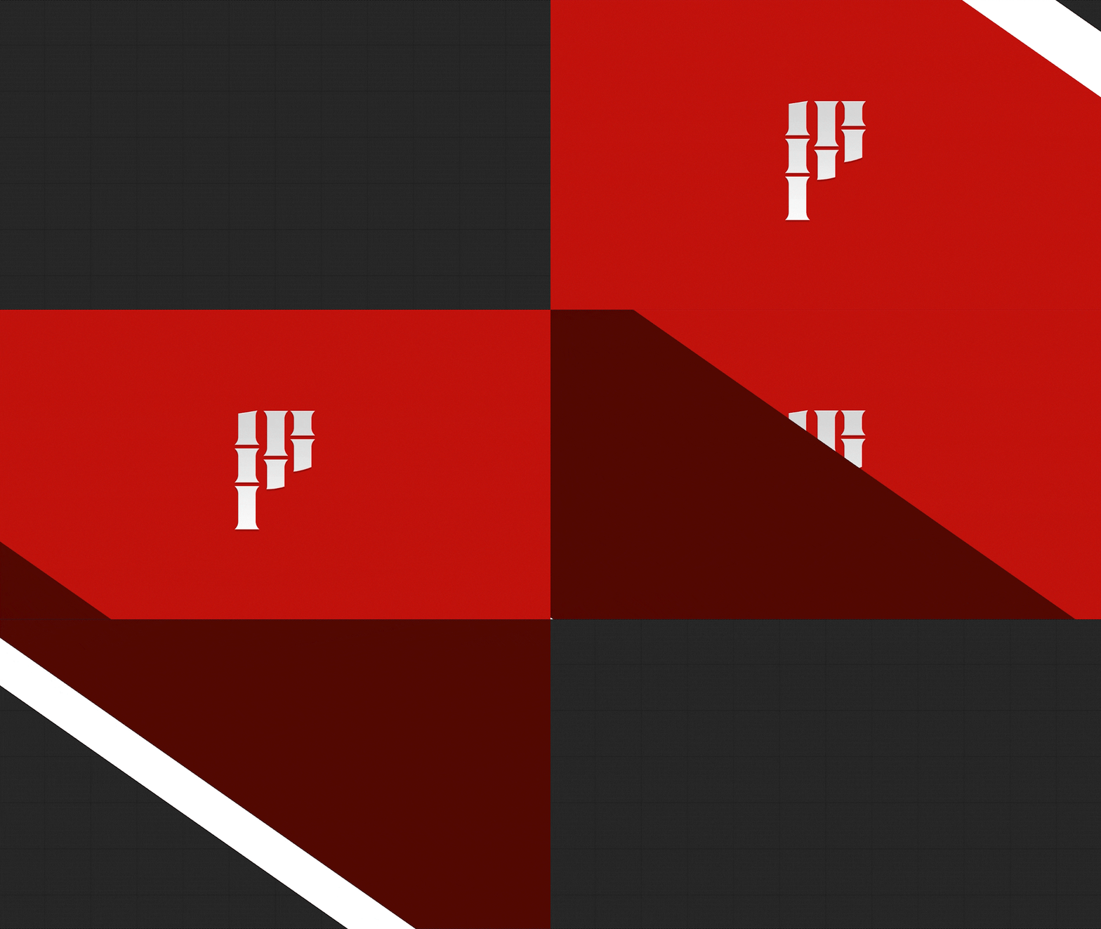
The transition interrupted momentum for nothing. No kills, no damage, no results, just a logo between rounds.
04 — Timer UI
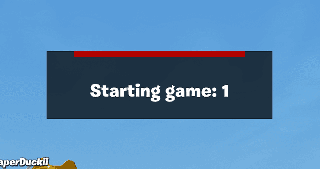
The timer felt flat. In a competitive map, a countdown should feel urgent. This one didn’t.
RESEARCH
I looked at how other creators handled competitive UI, and studied games outside the platform that actually nail that competitive feel.

Competitive pacing
In high-performing maps, transitions are nearly instant. Players jump back in before momentum breaks.

Reducing Cognitive Load
Selection required extra steps, transitions cared more about branding than stats, key elements had no real visual hierarchy.
COMMUNITY FEEDBACK
“Remove the red screen — it ruins momentum.”
— @Edgelaw
“Plz remove this screen between rounds.”
— @Juqnpi
KEY INSIGHTS
Competitive players value momentum and measurable performance.
UI should reinforce speed and clarity not interrupt the loop.
SOLUTION
01 Simplified Team Selection
Combined selection and confirmation into one step. Replaced “Skip” with “Close”, cutting friction in half.
02 Rank and Health Integration
Redesigned rank and health as one cohesive system. Aligned spacing, consistent contrast, same visual language across all competitive maps.
03 Performance-Based Round Transition
Replaced the branded splash with a performance scoreboard. Players see kills, damage, and results in the same window.
04 Elevated Countdown Hierarchy
Increased timer contrast and visual weight.
CONSTRAINTS

UEFN Limitations
UEFN doesn’t let you fully override native elements.
Performance
High intensity on lower-end consoles.

Screen Real Estate
Gameplay clarity always takes priority
IMPACT

Standardized framework

Faster map launches
Positive feedback
REFLECTION
This one taught me that systematic thinking pays off over time. Building one reusable framework instead of one-off screens means every future map starts from a stronger baseline.
Honestly, the hardest part wasn’t the visual design, it was working inside UEFN’s limits and finding workarounds when the platform didn’t give me the tools I wanted. That kind of problem-solving is the part I carry forward the most.
Desert Zonewars had a huge player base years ago, then lost steam. I made a 3D car drifting edit that leaned hard into the nostalgia, and it took off. Old players who’d forgotten the game existed came flooding back.
0M+
Views
0M+
Comments

Blender
After Effects

Premiere Pro
11M views · 1M likes
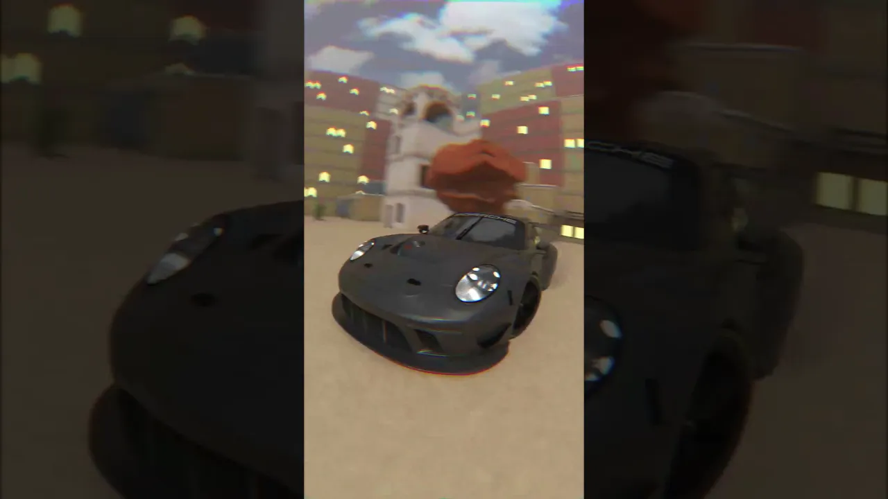
554K views · 52K likes
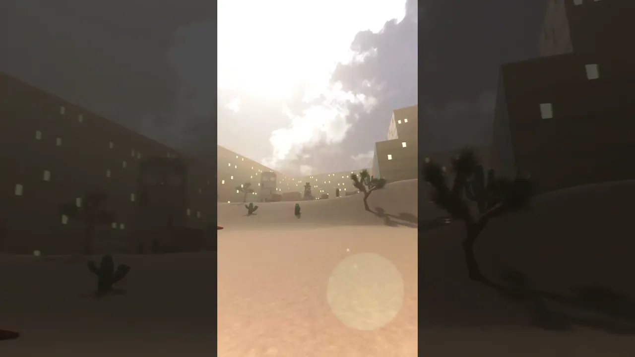
251K views · 29.7K likes
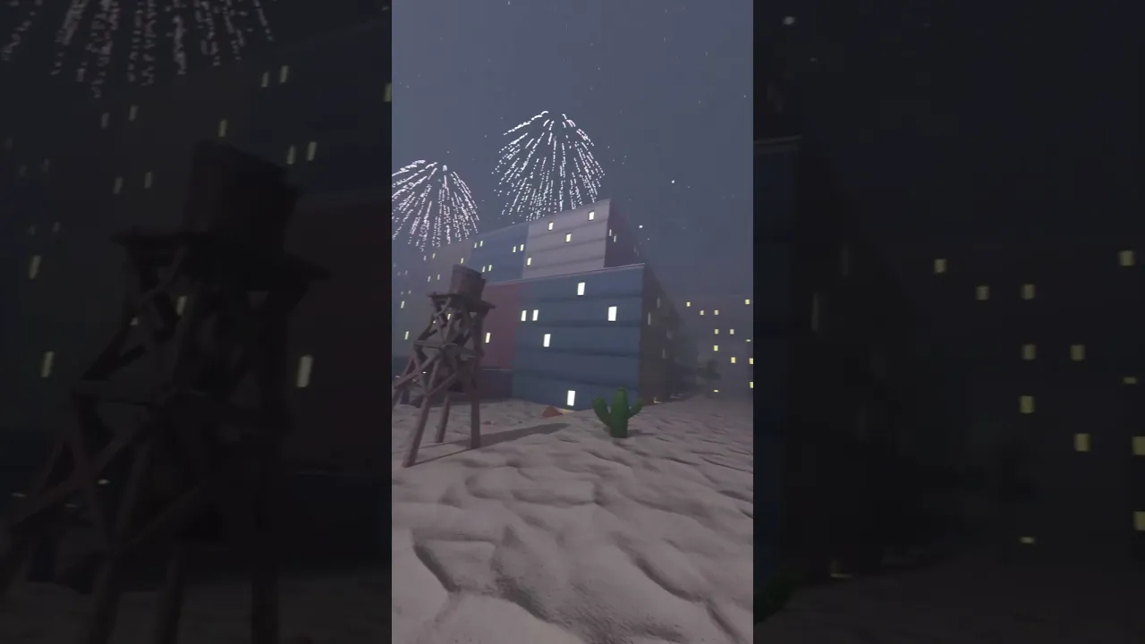
86.1K views · 8K likes