
Fidelity Redesign
ROLE
User Experience Design,
User Interface Design
TIMELINE
June 2026 - July 2026
TOOLS
Figma, Figjam
ABOUT
This is a concept redesign, not a shipped product. What’s here is my design thinking on how I approached modernizing a genuinely outdated app and where I pulled the scope back once I understood what I could actually defend as a solo designer. This also isn't a full ground-up redesign of Fidelity's app. It's focused on the specific flow that came up in research.
RESEARCH - USER INTERVIEWS
I asked a few friends who invest, or who’d consider it, about their own experience with apps like this. Questions covered:
The answers: Fidelity feels outdated and intimidating next to newer competitors. Other apps lean on animation and feedback throughout the experience that makes investing feel more approachable.
RESEARCH - USER JOURNEY
Buying a stock takes 8 steps:
Login
Press Transact
Search
Pick stock
Hit buy
Enter amount
Preview
Confirm
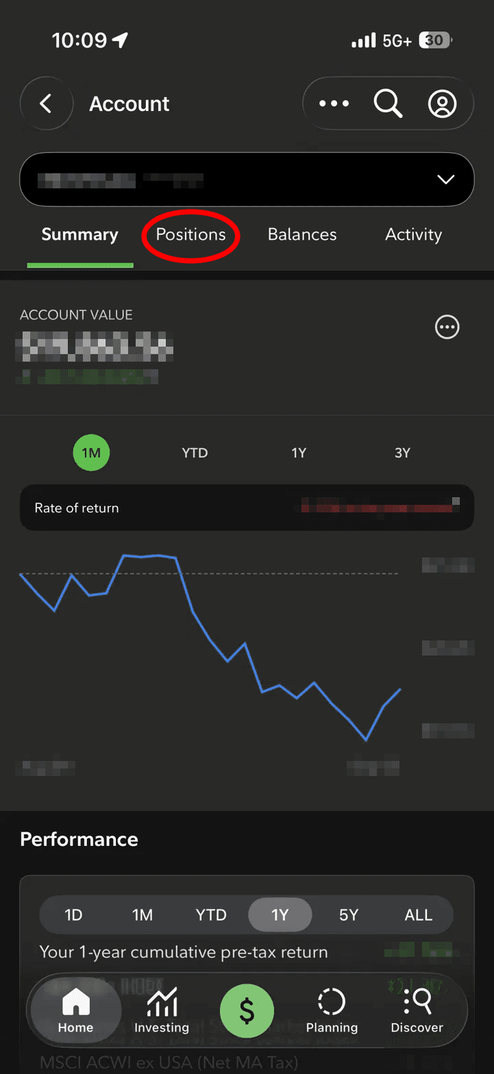
Positions are no better. Tap a stock from your positions list and you only see what you own, shares, cost, gain/loss, not how the stock is actually doing. To check that, you have to back out and search for it separately.
Tap stock in positions
Shares, cost, gain/loss only
Back out
Search stock again
Finally see performance
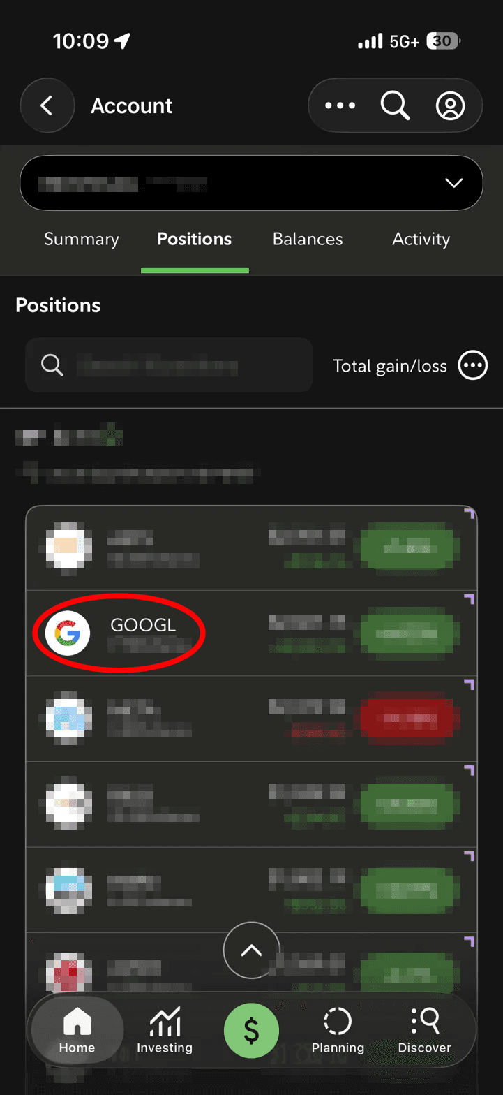

Every account, Individual, Roth IRA, is just a number and a percent, no graph, no sense of how any single account is actually trending over time.

RESEARCH - COMPETITOR ANALYSIS
My focus is specifically on how approachable each platform feels to someone who’s nervous about investing, not a full feature-by-feature comparison. I’m comparing ease of use and first-impression friction across Robinhood, Cash App, SoFi, and Charles Schwab, since that’s the actual axis Fidelity is losing on.


Pros
Fastest, simplest onboarding of the five
Colorful, game-like interface lowers the intimidation barrier
Genuinely well-crafted UI/UX, one of the most polished interfaces in the category

Cons
Encourages impulsive, fast trading, the GameStop trading restrictions in 2021 drew real scrutiny for this
Limited account depth, no real retirement account options
Pushes Robinhood Gold, its paid subscription, aggressively throughout the app

Pros
Simplest onboarding of all five, most people already have the app
No account minimum
Cons
Barely a real investing platform, stocks, ETFs, and crypto only
No research tools, charts, or analyst ratings

Pros
Nearly as complete as Fidelity, with gentler onboarding
Strong free educational content for new investors
Cons
Still not simple, plenty of screens and terminology a first-timer won’t recognize

Pros
Beginner-friendly, all-in-one financial app feel
Free access to human financial planners, rare at this price point
Cons
Shallower research and analysis than Fidelity or Schwab
Smaller range of investment types than the larger brokerages
PROBLEM
SOLUTION
SOLUTION - GOALS
01
Surface balance and status immediately
02
Order information by urgency, 10-second answers up front, depth on tap
03
Bring in small feedback moments without tipping into gamified, impulsive territory
04
Reduce trade steps, without removing the moment a user confirms what they're doing
SOLUTION - USER FLOW

DESIGN - LOW FIDELITY



DESIGN - FINAL
Addressing the dated, clinical feel of Fidelity's real login screen, I tested three different visual directions before committing to one, each standing in for a different brand personality, serious, clean and friendly.





This allows users to:
See their balance and today's change the moment the app opens
Check how each individual account, not just the combined total, is actually trending, since every account now carries its own graph
Swipe between accounts naturally, without needing dots to explain that more content exists
Addressing the problem of Fidelity's positions tab showing only what you own, shares, cost, gain/loss, with no way to see how a stock is actually performing without backing out and searching for it separately, I combined ownership and performance into a single view.
This allows users to:
See the actual price chart, market value, total return, and analyst rating on the same screen as their shares owned
Skip leaving the page just to check whether a stock is up or down today
View key financials at a glance instead of hunting across four separate tabs, Overview, Research, Options, Positions


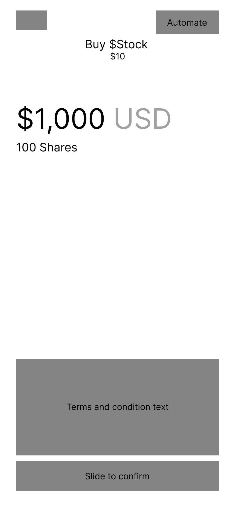
Addressing the 8-step buy flow in Fidelity's real app, including an unnecessary Transact detour and a Preview/Accept split into two separate screens, I collapsed the entire flow into 6 steps


REFLECTION
I started this wanting to help Fidelity compete harder for younger, first-time investors. That's more of a business strategy question, not something I can truly solve.
Scoping down to UI modernization and step reduction taught me the small, unglamorous decisions, cutting a redundant label, collapsing two screens into one gesture, reordering what shows up first, moved things more than a flashy full redesign would have.
This was a fun side project, worked on and off rather than in one focused sprint. Redesigning something I actually use made this personal in a way! I wasn't assuming someone else's frustration, I was fixing my own.
That's probably the throughline for me as a designer. I care most about the work when the problem is one I've actually felt.